Inglis Academy

- Audition for Boutique Art Coaching
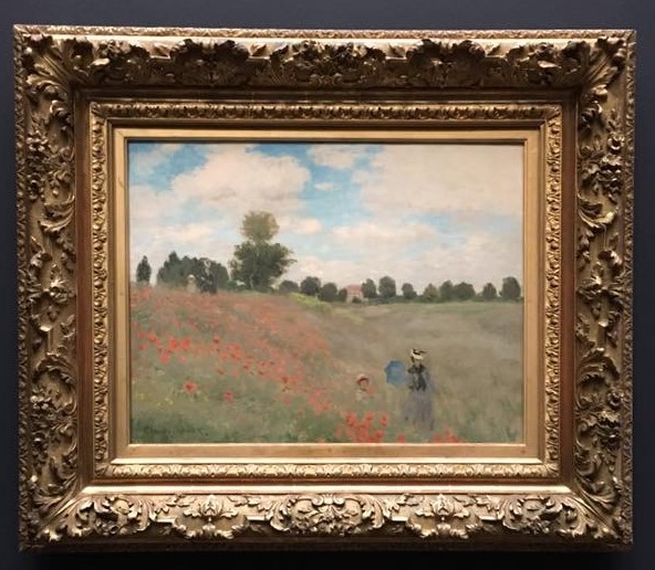
- In your audition I will coach you through processes and techniques as you complete this iconic Monet.
- tagauditionart-coachingindex
- Keep informed with my SMS alerts
- tagart-coachingindexcontact
- 2023 edited: 16-08-2023
- Address enquiries to info@inglisacademy.com
- tagindexcontact